These are a selection of many different influential Low/Mid budget idents. They are clearly less 'glamorous' than the 'big six' for example but each have influential qualities, especially the light colouring on the dark background as seen in almost all of these idents. I particularly like the 'Impact Pictures' ident with the words written in 'blood red' inside the light bulb as seen in the collage just below.

I am also particularly fond of the 'Impact Pictures' Ident (above left), which has a high-budget sic-fi feel to it that I think is particularly powerful. I like the blue glow moving in from the left and lighting up the words 'Impact' and 'Pictures' either side of the half moon image splitting the titles. I particularly like the colouring on this Ident as it is relatively simple yet it empowers the title's, which is undoubtedly the most important part to most film company idents/logos.

I am also fond of the 'inFilm' logo, despite its simplicity. I particularly like the use of font, with the 'F' clearly standing out on the black, block background. The 'Infinitum Nihil' logo also stands out for me as the red square image is very striking. I was instantly drawn to the logo as it is again extremely effective when placed on the block background. It would be good for us to use a block background of any colour and then employ the logo/text (name of company) over the top of that background.

'Initial Entertainment Group inc.' employs an interesting use of colouring for its logo/ident and I especially like the beaming circle of light in the middle of the image with the title of the company placed inside. The contrasting blue's here is extremely effective and is something we would like to employ in our very own ident. This idea of contrasting the same colour in different shades as seen above is something of influence to us. The icon is also something that needs to be thought about in order for it to be 'eye-catching' and memorable for the audience. I feel that the 'Illusion' logo (bottom left) does this extremely well as the image of the bird is quite striking and stands out in comparison to the rest of the idents around it. We would perhaps like to make something similar using their logo as an influence to us.
Some original ident planning was undertaken by my partner in the group, Max Twyman, however after this didn't come to fruition and we realized that the more technically advanced of the two of us was myself, the making of the ident using the previous plans was left to me. The planning can be seen below (for the distribution company ident), from my partners blog.
"
Ident Planning
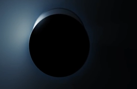
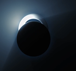
We have decided to entitle our production company 'Encrypted Entertainment' and use the influence of 'Entertainment One's' logo and moving ident. I particularly like the way they have the 'E' emerging from behind a black circle background and would like to create something similar for our ident:


 An Ident idea which I made in order to make the introduction to our trailer slightly more professional is that Gamechanger Films. With inspirations coming from companies such as 20th Century Fox and Lionsgate, shown right, we eventually chose a mixture of the clean font of Columbia and the clean black background of Universal as the main inspirations. This led us to choosing a font, a design and whether there was going to be anything in the background. The layer order, final design, font set up and effects used can be seen in the Photoshop screen grab below.

"
This however never came to be, as the relatively simple looking ident actually took a lot of precision and skill to engineer. Instead of this, we decided that we should design an ident which plays on the idea of the word "Encrypted" rather than the letter "E" as previously seen in the research. This was done through word association, where friends and family were asked what they associated with the word "Encrypted" - results of this can be seen below, with screenshots taken from a skype chat.
Taking forward this idea of security, programming and coding, it seemed logical to have an ident/multiple idents which reflected these ideas. However the making of this ident proved to be too time consuming and difficult as the ideas we had were far too ambitious. A demo of what was attempted can be found below, done by my partner Max, and is not going to be used.
An Ident idea which I made in order to make the introduction to our trailer slightly more professional is that Gamechanger Films. With inspirations coming from companies such as 20th Century Fox and Lionsgate, shown right, we eventually chose a mixture of the clean font of Columbia and the clean black background of Universal as the main inspirations. This led us to choosing a font, a design and whether there was going to be anything in the background. The layer order, final design, font set up and effects used can be seen in the Photoshop screen grab below.
Then came the animation, using Sony Vegas, to mix up the software from the previous ident using Motion, we took this idea of encoding from Encrypted entertainment and carried it over. Utilization of the TV simulator effect, as well as ready made effects used in motion and light flares allowed us to create an ident which both looks clean, professional, and resembles one usually seen professionally. It can be seen below. Sound may still be added, however a silent ident at the start of a tense film, if done correctly, has a majorly positive impact on the first act.
JL MT
No comments:
Post a Comment