Friday 12 December 2014

Finalised Holiday Filming Schedule

This is the schedule for our filming dates coming up due to the fact that we want to complete all of our filming over the christmas/winter break in order to leave ourselves with enough time to complete the editing as well as get underway with our ancillary tasks (poster & magazine cover). We felt it was necessary to plan our time ahead in order to keep on top of things over the holidays, whereby daily contact is not as easy.

Filming Schedule:


MT

Tuesday 9 December 2014

Institutional Analysis of Little White Lies

The publisher of the magazine Little White Lies is TCOLondon. This is a company which specialises in slightly off the wall, individual and quirky takes on stories which would not usually get views, or angles on films which are not usually assessed. The very branding of the website (www.TCOLondon.com) as shown below differentiates itself from other forms of media by defining itself as a breed, something which is lifelike and ever evolving. From work in skateboarding, phone companies, games consoles, and sponsoring YouTubers, their list of partners ranges from Grolsch to Audi. This shows where the inspiration for Little White Lies comes from, as well as why the company decided to back such an out-there product. Even within their distribution, with Little White Lies originality being an online-only magazine, they establish themselves against the norm and through this use of technology cater to a specific audience.


This audience is that of 18-30 year olds who are either young professionals in or students of media. They must have significant disposable income because of the monthly subscription of £3.95 for a product which, looking past its potential as a collectable and art, provides less than a week of entertainment. This suggests than that like Empire and Sight&Sound, that the demographic for the company is ABC1 and massively involved with South East London promotions. This is done in the Barbican, BFI and Picturehouse cinemas' and film festivals which caters to the sort of indie film buff audience with disposable income. The benefits of this are found within independent and cult cinema fans who would rather discuss films as an art form rather than just passive entertainment. The magazine caters to independent critics and in depth interviews with cast, directors and producers in order to help their readers form opinions upon the films they cover. 


The magazine, along with others' of its type, use mosaic geodemographics in order to establish the type of person their product is going to cater towards. An audience segmentation can be found below. This shows that the majority of the audience is found within London based Hipsters which falls under the magazines demographic of Group O buyers, standing for Urban Intelligence that 'Mostly consists of young and well educated people who are open to new ideas and influences'. It also caters to audiences such as Group E, young people who have gone through higher education and can be liberal of idea, and have access to disposable income. It caters to this audience through claiming to be about truth which connotes authenticity. Because of this, the more niche audiences of Arthouse film fans and Aspiring filmmakers are also catered towards, while more mainstream film fans and design students are left to read magazines like Empire and Total Film.


The purpose of the magazine fits with the publisher's slightly independent style of reporting. Even from the weight of the paper the magazine feels like a substantial product, filling a gap in the market for collectors items concerning film, which is then corroborated through the hand drawn/graphically modified artistic style of the covers (Of which they employ independent designers) and the typography of the front cover. The choice of film is also essential as to its purpose, and in turn the sorts of audience which are going to read it. Taking up yet another niche gap in the market, focusing on films such as "Black Swan" and "Let The Right One In", they decipher films which are not only in between the mainstream and indie genre but also those which are going to obtain a cult following. Due to this, in combination with the subtle yet aesthetically pleasing cover which screams that the magazine producers know their movies, the magazines' purpose is to fill a gap in the market between Empire's mainstream coverage and Sight & Sound's more individual movie coverage through an artistic and bold cover, substantial page thickness and quality which would leave you wanting to show your collection off to your friends. 

Saturday 6 December 2014

Empire "Bourne Legacy" Magazine Cover Analysis

This is a piece of analysis on one of 'Empire Magazines' front covers completed using the Photoshop software on the Mac: 

MT

Wednesday 3 December 2014

Film Poster Research - The Conjuring


Connotation - The significance of the Rope hanging from the shrivelled tree in front of the large 'haunted' looking house introduces the horror/thriller genre. The rope connotes death, which will obviously play a major part in the film and links together the idea of death and haunting, which again is a major theme of this horror movie. The black block letters spelling out 'The Conjuring' placed against the mirky white background of the sky also connotes this idea of good vs evil as shown through the contrasting Black and White. Death is the major theme present on this movie poster and this is backed up by the image of the shrivelled tree, which represents the loss of life and hope, which are again major themes of the film itself.  After looking at the poster, we as the audience, undoubtedly understand the message of the people who created it through connotation.

Anchorage - "Based on the true case files of the Warrens" - This certainly effects the way the poster is viewed as an audience member and is often used in Horror Movies to attract the audience and cause them to feel more scared of the events in the film itself. This causes the audience to be more likely to believe the events in the film and thus feel terrified when watching it. It is important to put this on the film poster itself as it will attract more people to watch the film at the cinema when it is released. "If it is based on a true story, the film instantly becomes more scary" - This is the idea behind why this line is placed on the movie poster.

Tone and Register - The tone of the poster is clearly one of death and decay as shown by the shrivelled tree and the old wooden built house in the background. You know straight away that this is a poster promoting a horror movie due to the dark undertone, as shown by the central hanging rope representing death.

Intertextual references - "From the Director of Saw and Insidious" - lets the audience know what type of film they are likely to be going to see as they can base their opinions on these previous films mentioned. This certainly attracts the audience to watch a certain film, because if they enjoyed either, 'Saw or Insidious', then they are more likely visit the cinema and watch the film. The institutions are also referenced, which is also important as the audience will familiarise themselves with these well known institutions and perhaps be more likely to go and watch the film. 

Target audience - The intended audience for this movie would undoubtedly be horror movie fanatics or people who are looking for a thrill. It is mostly aimed at an audience between the ages of 15-23, who are more likely to travel to the cinema with a group of friends or even a date to watch a scary movie. Judging from the poster, the target audience would be more likely to be a male audience between the ages of 15-23 as they follow the stereotype of, 'Being harder to scare'. Having said this, a female audience is still targeted, but the focus for most horror movies is usually placed on the larger male audience as they will often bring a woman with them to watch a horror movie.

Representation - the poster clearly plays on the stereotypes of most horror movies, with the large bedraggled house in the background representing this idea of a haunted house and a family being haunted by an unknown presence as represented through the image of a shadowed figure in the foreground of the poster. Despite the clear representation of death on the movie poster, the small glimmer of light appearing over the top of the house could be seen to represent this idea of hope and that good will prevail.

Effect and Effectiveness - This movie poster is undoubtedly successful in getting across the genre of film through the images it presents the audience with. It is evident that it is a poster promoting a horror movie almost as soon as you glance at it, due to the choice of images (large house, rope, tree) and the dark, almost gloomy colour chosen for the background. The poster could possibly be more successful if their was a phrase or line inserted to attract the audience to think in more depth about the poster and in turn create a wider audience for the film. However, in terms of attracting an audience, this poster is certainly effective as it attracted me to want to travel to watch the film.


MT

Film Poster Analysis - Road to Perdition


Connotation - The visual image of the father and son wearing similar clothes and holding hands connotes this idea of a family bond, which is central to the main theme of the film itself. Tom Hanks holding the Gun and the shadow covering half of his face suggest something different and create mystery around the poster. This links into the Film Noir style that the poster is clearly trying to connote. The rain splattering across the poster also creates a powerful image. You can almost hear the rain, which connotes the idea of the family bond as aforementioned being broken, which is a major part of the film, due to the fact that the son witnesses what his father (Tom Hanks) does for a living. The film noir style of this poster is certainly shown through all the visual images presented to the audience. (shadowy image of Tom Hanks character and his son with the street lights in the background).

Anchorage - The Anchorage, despite being minimal in terms of actual text on the poster, it is certainly effective in that it almost gives reason to the picture of Tom Hank's character and his son. "Pray for Michael Sullivan" suggests that Tom Hank's character will experience many problems throughout the trailer and with the words placed above the 'Tommy Gun' again suggest that the problems he will face will be particularly dangerous. The Bold Gold text spelling out "Road To Perdition" also heightens the situation, which is clearly shown through the image in the background. It gives a sense of importance to the two characters on the poster and almost forces the audience to notice the bankable actors names just above the title of the film.

Tone and Register - The tone on this poster is certainly quite dark and mysterious as shown by the Film Noir style. The long coat and trilby hat working in collaboration with chiaroscuro effects undoubtedly create a mysterious tone and link with one of the major themes of the film itself, Betrayal. The Dark tone is accentuated by the shadow image of the Gun in the bottom left hand corner and the rain splattering across the poster. They work well to create a moody atmosphere and link in with the text as aforementioned.     

Intertextual References - "from the director of American Beauty" - This informs the audience on the style of film they are looking at and might create a wider audience as fans of that particular director might want to see the film for this reason. The institutions are also placed on the poster to again attract the audience to see the film as they would recognise the companies producing and distributing the film.

Target Audience - The target audience for this film is certainly focused on the larger male audience. This is because Tom Hank's character is clearly a father figure, which would attract a male audience. Also, it is clearly a gangster style movie as clearly shown by the 'tommy gun', which again would be seen to please the male audience more. However, the theme of family values as shown by the two characters holding hands, could attract a female audience. Woman may also be attracted to watch the film by the names of some of the stars featuring in the film, such as Jude Law. However, the film is clearly aimed at a larger male audience.

Representation - The dangerous world of gangsters is clearly represented through the dark imagery of the father holding hands with his child whilst holding a 'tommy gun' in his other hand. This could represent the fact that once someone has become involved in that lifestyle, then everyone around you becomes affected, even your children. It's particularly powerful as the innocent image of the child, who appears to be dressed in a similar way to his father, has been caught up in the dangerous lifestyle of his father. The fact that you cannot see the boys face is also powerful as it represents this image of a loss of hope, which is counter-acted by the shining lights in the background of the image.

Effect and Effectiveness - This poster is undoubtedly effective as clearly shows the major themes f the film itself, which are Family Values and Betrayal (Shown by holding hands and Gun, coupled with film noir style and the rain).  The anchorage is also effective as it enforces the themes of the movie, by implying that Tom Hank's character and his son are on their own in the movie and have little help from the people around them.


MT

Film Poster Analysis - Hummingbird


MT

Film Poster Research - Zodiac


CM

Film Poster Research - Raiders of the Lost Ark


The iconic whip, as well as a sword and gun, suggest that this is a film involving a lot of action and adventure, with the imagery of the Ark and temple bring in the idea of antiquities, archaeology and ancient civilisations. This is also suggested by the golden colouring of the poster (emanating from either Harrison Ford or the Ark), which suggests value to the artefacts and lends even more of the adventuring atmosphere. The numerous faces and their expressions connote various things about their characters, such as the 'damsel in distress' figure of the dark haired woman, or the shadowy ominous figure of the bespectacled nazi. These faces, the weaponry, the stance of Ford, the snake, the burning at the stake image, and the imagery of archaeology, all paint 'Raiders of the Lost Ark' as a proper, adventurous, thrilling outing.

'The Return of the Great Adventure' is an interesting strapline as it both suggests a harkening back to an older style of cinema, where adventurers and goodies vs baddies was more common, but also a new spin on the style, which could appeal to both older and younger audience. The title is reminiscent of an old comic book title or of a Douglas Fairbanks Jr film, as well as being exciting and intriguing, which links back to the idea of a 'revisiting' of the adventure genre.

Harrison Ford, with his buttoned down shirt, active stance, raised weapon, and Eastwood-esque headgear, is the classic adventure hero, fending off the heinous nazis with one hand back to protect both the story's heroine, and the Ark. The tone of the poster is thrilling and action packed with a lot to take in, whilst still retaining an emphasis on the characters and features of the film itself. The nazis are all straight-faced and solemn, a sense of formality surrounding them and contrasting with the not-altogether-groomed look that Ford is sporting, clearly painting him as the anarchic and free thinking hero to battle the authoritarian nazi antagonists. The tone of the poster is compliant as such, with a playful and fun spirit behind it that is combined with the thrilling and active imagery of adventure.

There is reference to the older genre of adventure films in the poster, and many of its hallmarks are drawn on. Obviously nazi and obviously middle eastern figures appear, a feature of the more conservative nature of earlier Hollywood cinema, and the poster's style of art and arrangement is distinctly evocative of film posters of that era. 

The film is obviously directed at a younger male audience, with the poster featuring stereotypical 'hero' and 'damsel' figures, and presenting a sense of morality that is simpler and more 'black and white'. The attractive female and aspirational male are obviously directed at a certain gender. In terms of age, the genre would traditionally appeal to younger consumers, although there is an attempt to be more 'catch all' in the revisiting of an older genre and the angle that that is directed in. 

In terms of representation, all but one of the figures appearing on the poster are men, all but two are white, and all but three are white men. The woman is in a submissive, frightened pose that depicts her as the 'damsel' figure who needs protecting by the manly Ford. The two middle eastern men on the poster are not central to the plot particularly and can thus be viewed as having been put in the poster as 'curiosities' to make the film seem more exotic or adventurous. This, paired with the depiction of the evil nazi German antagonists could give an air of xenophobia to the poster.

The poster is very effective at conveying genre and character through colours, figures, and imagery. It draws in a wide audience with promises of excitement and adventure whilst remaining a sophisticated and eye catching piece of advertising.

CM

Tuesday 2 December 2014

Film Poster Analysis - Sin City; A Dame to Kill For

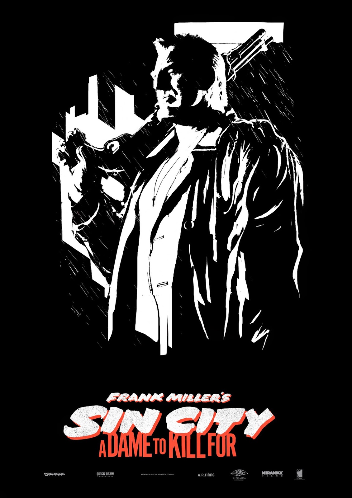
Varying aspects of the poster for "Sin City; A Dame to Kill For" pose many questions as to the connotations of the film as a whole, as well as the poster. The lack of colour, not only typical of the previous instalment of Sin City, also draws contrast between the black and white figure of Mickey Rourke in centre shot. The contrast can suggest a variety things, some of which include good VS evil, old VS new and the abundance of the two opposites of the colour range suggests conflict. It is commonly perceived that an excess of white can be viewed as cold, harsh and isolating which is emphasised through the implied danger of the gun and remoteness of Mickey Rourke. Barely visible is a necklace holding a cross around his neck, which bears implications of religion, hope, and forgiveness even when juxtaposed with the dismal, apocalyptic feel of the black white and red poster, showing rain in the background and Rourke's menacing figure in the foreground.

The anchorage of the poster, although minimal, has a great effect on the viewers understanding of the poster. With the sequels title, "A Dame to Kill For", it not only gives purpose to the isolated, strengthened looking character who dominates the poster but also suggests varying characteristics associated with him. Although portraying him as violent, it also suggests a passion, with both characteristics being highlighted through the use of red in the text alone. Without the text, one would imagine a comic of some sort set late into the 20th century, however with the text we realise not only is it set much later than imagined but it is also a film, Frank Millers attempt to out do his previously acclaimed film.

The tone of the film, portrayed through the poster, is obvious. With the comic book style of the cover combined with the knowledge that this is Frank Millers Sin City sequel, one can tell that the tone will be desolate, isolated and violent, possibly taking the same bleak and apocalyptic colour scheme of the first film in order to create a similar atmosphere. With the majority of interaction between humans being non-verbal, the image paints a vivid picture of what the audience is to expect from the film, with the baggy leather coat, low cut shirt and hefty shotgun slung over one arm painting a sinister and action filled picture. The register of the poster is also important, with the specific use of the word "Dame" instead of woman, girl, wife or any of the other options which could have been used. Being the female equivalent of a knighthood, a sense of importance is portrayed, which is reiterated through her being distinguished from other Dames as "To Die For".

There is one intertextual reference, with "Frank Miller's" being placed above the title, linking it to the previous Sin City Film. This has the effect of drawing in an audience which enjoyed the first film, which is a large proportion of action film fanatics due to it being considered one of the best action films of all time. The accompanying poster to the previously shown features Jessica Alba, boasting a high valued cast and implied sexuality on top of a previously standing legacy. This increases the target audience from action fans to fans of Mickey Rourke, Jessica Alba, and star studded line ups featuring both old and new stars. Appealing to mainly a young audience, the use of Rourke, Willis and Liotta also appeals to the elder, traditional action/adventure fans.

The poster displayed is very effective. Whether this is because I am the target audience, or because of the poster its self, it makes me intrigued to watch the film as not only a Sin City/Frank Miller fan but also an appreciator of good film. Maintaining the comic book style of the previous posters and expanding on them in the new film has kept the films previous reputation while inducing new audiences who would not have been previously interested.

Monday 1 December 2014

Film Poster Analysis - Welcome to The Punch


JL

Film Poster Analysis - The Godfather

The colour scheme of The Godfather poster is typical of films of the genre. The use of null colours, with no texture nor shade in combination with the contrasting reds, whites and blacks suggests conflict between two clear cut sides of a strife with the blood red shade of the mans face emphasising this. There are also suggestions of old vs new, again highlighted by the contrasting colour scheme of the poster. The elder is seen as more powerful, due to the use of puppet strings over the title of the film. Puppet strings are often shown as signs of manipulation and power, both themes central in the previously mentioned film. There are alternate posters for the film "The Godfather", one of which showing a shaded character with a rose in his pocket. Of a similar colour scheme and nature of this poster, we can also reference the connotations of the rose in film. Showing passion and an ability to love, but it is also commonly viewed that roses have a more negative connotation, seen from their thorns. Again representative of the film, something beautiful and powerful can also have a dark side and being the only object of the colour, this darker side is emphasised. Finally, the lack of clarity and definition of the poster reflects the film itself, with hierarchy's of power constantly being challenged.

The anchorage of this poster of "The Godfather" is of major importance for a first time viewer of the film. Without it, one would imagine a comic book, possibly of Marvel's darker section with the black and red dominating the poster. With the text however one realises that the poster actually represents a film, shown through "Paramount Pictures Presents" which not only shows the poster as advertising a film but also attempts to entice fans of the production company Paramount to see the film. There are also connotations in the text of the poster, with "The" godfather suggesting an unparalleled power, and a godfather which everyone knows about. The word "Godfather" itself has previous Mafia links and is reflected in the film, however it also suggests a link between the viewer and the Godfather, enticing the reader further. Finally, the font of the poster title seems expressionistic yet clean, again reflecting the contents of the film.

The tone of the poster, and in turn film, is a dark one. With the dominating colour being black there is a negative and sinister tone suggested through the colour scheme. There are also suggestions of conflict and blood through the blood red colour of the dominant figure in centre shot. There are also levels of formality which are implied through the poster, as previously mentioned the use of "The" instead of "A" or an alternate phrase suggests a familiarity and power which is unrivalled. Through the facial expression and positioning of the man in centre shot, we can also see that the poster takes a dejected, solemn tone which again is reflected in the colour scheme.

There are no intertextual references as such, however the "Paramount Pictures Presents" takes part of the viewers focus away from the poster and to the production company. This becomes more and more important in the two sequels of The Godfather as it links them to the previous films through title and production company.

The target audience of the poster is relatively obvious. The dark, sinister use of black and red with the film being an 18 itself closes the target audience off from the bottom end of the most typical film market (15-24) and opens the film up to more adults, suggesting a maturity about the film and connoting themes which only the elder generations can understand. It is also directed at a primarily male audience, with the person in the position of power in both the title and poster being a man. It also sells itself to a fan of good film, with a minimal poster suggesting the majority of the marketing to be done in hype around the film itself.

There are no obvious ideologies in the poster, simply due to the lack of character definition in the poster and the null colours. Through knowing the film, one can suggest that through the lack of vibrancy and emotion in the poster the gang/mob life is looked down upon as not always coming out on top, which is slightly emphasised through the facial expression of the man on the poster.

Sunday 30 November 2014

Final Narrative Graphics

"From the Directors of"


"When you are caught between two worlds"


 "Which way do you turn?"

Tuesday 25 November 2014

Saturday 22 November 2014

Ident Planning and Research

These are a selection of many different influential Low/Mid budget idents. They are clearly less 'glamorous' than the 'big six' for example but each have influential qualities, especially the light colouring on the dark background as seen in almost all of these idents. I particularly like the 'Impact Pictures' ident with the words written in 'blood red' inside the light bulb as seen in the collage just below.


I am also particularly fond of the 'Impact Pictures' Ident (above left), which has a high-budget sic-fi feel to it that I think is particularly powerful. I like the blue glow moving in from the left and lighting up the words 'Impact' and 'Pictures' either side of the half moon image splitting the titles. I particularly like the colouring on this Ident as it is relatively simple yet it empowers the title's, which is undoubtedly the most important part to most film company idents/logos. 


I am also fond of the 'inFilm' logo, despite its simplicity. I particularly like the use of font, with the 'F' clearly standing out on the black, block background. The 'Infinitum Nihil' logo also stands out for me as the red square image is very striking. I was instantly drawn to the logo as it is again extremely effective when placed on the block background. It would be good for us to use a block background of any colour and then employ the logo/text (name of company) over the top of that background. 


'Initial Entertainment Group inc.' employs an interesting use of colouring for its logo/ident and I especially like the beaming circle of light in the middle of the image with the title of the company placed inside. The contrasting blue's here is extremely effective and is something we would like to employ in our very own ident. This idea of contrasting the same colour in different shades as seen above is something of influence to us. The icon is also something that needs to be thought about in order for it to be 'eye-catching' and memorable for the audience. I feel that the 'Illusion' logo (bottom left) does this extremely well as the image of the bird is quite striking and stands out in comparison to the rest of the idents around it. We would perhaps like to make something similar using their logo as an influence to us. 

Some original ident planning was undertaken by my partner in the group, Max Twyman, however after this didn't come to fruition and we realized  that the more technically advanced of the two of us was myself, the making of the ident using the previous plans was left to me. The planning can be seen below (for the distribution company ident), from my partners blog.


"

Ident Planning

We have decided to entitle our production company 'Encrypted Entertainment' and use the influence of 'Entertainment One's' logo and moving ident. I particularly like the way they have the 'E' emerging from behind a black circle background and would like to create something similar for our ident:


"

This however never came to be, as the relatively simple looking ident actually took a lot of precision and skill to engineer. Instead of this, we decided that we should design an ident which plays on the idea of the word "Encrypted" rather than the letter "E" as previously seen in the research. This was done through word association, where friends and family were asked what they associated with the word "Encrypted" - results of this can be seen below, with screenshots taken from a skype chat. 


Taking forward this idea of security, programming and coding, it seemed logical to have an ident/multiple idents which reflected these ideas. However the making of this ident proved to be too time consuming and difficult as the ideas we had were far too ambitious. A demo of what was attempted can be found below, done by my partner Max, and is not going to be used.


An Ident idea which I made in order to make the introduction to our trailer slightly more professional is that Gamechanger Films. With inspirations coming from companies such as 20th Century Fox and Lionsgate, shown right, we eventually chose a mixture of the clean font of Columbia and the clean black background of Universal as the main inspirations. This led us to choosing a font, a design and whether there was going to be anything in the background. The layer order, final design, font set up and effects used can be seen in the Photoshop screen grab below. 


Then came the animation, using Sony Vegas, to mix up the software from the previous ident using Motion, we took this idea of encoding from Encrypted entertainment and carried it over. Utilization of the TV simulator effect, as well as ready made effects used in motion and light flares allowed us to create an ident which both looks clean, professional, and resembles one usually seen professionally. It can be seen below. Sound may still be added, however a silent ident at the start of a tense film, if done correctly, has a majorly positive impact on the first act.


JL MT

Thursday 20 November 2014

Credits - Research and Influences

Zodiac:


Order of credits as they appear on screen and why:
  • 0.15secs - 'Paramount Pictures' appears on the screen - production and distribution company/s appears first before anything else and this is usually the case for all crime/thriller trailers. 
  • 0.30secs - 'From the Director of se7en and panic room' - promoting the director of the film and his previous work opens up a wider audience due to the fact that people who enjoyed the films mentioned are likely to go and see this one. This is more of a choice, often depends on the popularity/fame of the director. 
  • 1.43secs - 'Based on real events' - again attracts a wider audience and creates tension, which is the overall aim of the trailer.
  • 2.10secs - the three main actors are now revealed to again attract a certain audience and inform people watching who they are going to see. This is clear from the trailer itself but it is a necessity to show the actors names and often the bigger stars will have their names revealed before the other members of the cast.
  • credits appear at the end of the trailer (2.25secs) as they are stating who has been involved in the film/trailer we have just seen.
  • Simple white font (something easily found on either word/final cut and/or motion) on a plain black background. 
  • order of final credits is similar to the order previously mentioned.   
Departed:


  • 0.18secs - Production/Distribution company/s introduced again (usually most famous and most involved) - follows a similar pattern to Zodiac trailer. 
  • 0.34secs - 'A Martin Scorsese Picture' - similar pattern with director but this time they have chosen to reveal the directors name. 
  • 1.07secs - 'Loyalty is a lie' - the main tagline of the film is introduced, which gives the audience an idea about the major theme of the film, which in this case is 'trust'. I particularly like the way they have used two different colours (blue & white) in the graphics to again further support this tagline, that everyone in the film is 'two-faced' and the truth is not being told. This links into our film and the major theme of 'Two-Evils'. 
  • 1.16secs - 'Sacrifice is a test' - another tagline - creates excitement and again reveals the major themes of the film. 
  • 1.32secs - 'How far can you take it?' - third tagline.
  • 2.07secs - all the most famous actors in the film are introduced similar to that in Zodiac. 
  • 2.18secs - title of the film is introduced - good use of connotation with the title appearing in the shape of a gun as it not only suggests the genre of the film but leaves a lasting image in the audiences head, which will then carry into the film itself. 
  • 2.22,23,24secs - end credits introduced (same as in Zodiac).   
'Welcome To The Punch':


  • 0.19secs - production/distribution company again introduced first (momentum pictures)
  • 0.37secs - 'In 2013' - the graphics in this trailer are undoubtedly our major influence with the city landscapes appearing behind the the words themselves. This phrase also creates excitement amongst the audience watching as it adds a sense of pace to the action in this trailer. 
  • 0.41secs - 'Know' - same effect as previously mentioned. 
  • 0.45secs - 'Your' - interesting use of graphics that wasn't used on the two trailers prior to this one. Keeps you guessing as to what phrase will appear next.
  • 0.51secs - 'Enemy' - similar to departed these tag-lines/phrases set up the theme's of the movie as well as create excitement amongst the viewers. 
  • 1.08secs - executive producer/director introduced much later than usual. 
  • 1.42secs - 'Welcome' - clear that the title is going to be introduced in the same style as the taglines previously. 
  • 1.43secs - 'To' - "
  • 1.44secs - 'Punch - "
  • 1.45secs - whole title introduced - different to previous trailers as their is a short moment of action after the title is revealed and before the end credits are introduced at 1.48secs. 
MT

Tuesday 18 November 2014

Narrative Graphics Attempts

Narrative graphics are the black screen's usually accompanied by text which are shown throughout a trailer in order to enhance the storyline and allow the narrative to become clearer. Such examples of this come from Redemption, previously named Hummingbird, stating "Time to heal" and "A second chance" on two separate occasions. In conjunction with the shots shown, this tells us where the narrative is going and the tone of the film. By using relatively passive narrative graphics, instead of something along the lines of "Know your enemy" from Welcome to the Punch, one can infer that the tone will take a more emotionally based setting and there will be a lot more focus on the character and his relationships. Some examples of possible narrative graphics are shown below, which were made in one double period by yours truly.


The use of smoke in both narrative graphics board was inspired, once again, by Welcome to The Punch. The white and grey blocks in the background show that the middle is transparent, leaving us to find a moving motion picture or video, either shot by us or taken from a  non copyright website. The different colours, red and light blue, are the most prominent colours in our film and bear connotations of danger, desire and high budget films. Although not finalised, the textual content of the graphics comes from the idea of both the police and the underground gangs chasing our main character.


We found that the idea of having passive, still smoke on the narrative graphics looked too amateur however and as such changed it to show more technical ability. Using Motion, we created overlays, one of which utilised the using the effects "Embryo" with other effects such as blurs, and then animated to have it moving across the screen. Incidentally this overlay was also used in our ident due to how well it turned out. An example with the overlay on a black background can be shown below, as well as the motion settings which were used.


The Example:


The two above narrative graphics are shown below without added effects from motion and how they were composed using Sony Vegas 12. This was done through using the effects Motion Blur, Wave and Colour Correction underneath a black rectangle with the text cut out which was done in Photoshop (The second graphic down comes first)


Our final narrative graphic comes from inspiration found in Hummingbird. Although not exactly a narrative graphic as it does not extent the story, as such, introducing previous films which the directors have made is an essential part in raising awareness of the trailer. Because of this we created a background on Photoshop, made up of various layers of non-copyrighted images and including a picture of a sunset I took while in Greece. This was then overlayed with "From the Director's of" and either "Existence" or "The Shadow Man" depending on which shot it was going to be for. These were then assembled on Sony Vegas, again utilizing the Wave and Glow Video Effects to produce this graphic.

JL

Sound Influences - Redemption/Hummingbird


0.02secs - already a sound boom to open the trailer, followed by contrapuntal/asynchronous sounds of police car sirens against the opening image of the city and Soho 'backstreets' - the sound boom is used throughout most, if not all crime/thriller trailers and so we will want to use it as well. The use of asynchronous sound is also extremely effective here and we will want to create a similar effect. 


0.10secs - sounds of an alarm going off - adhere to the crime/thriller genre and keep the audience on the edge of their seat, which is a desired effect especially at the early moments of a trailer like this. We would like to play around with non-diegetic sound, such as alarm sounds and other 'tension-building' Foley sounds to create different effects at different moments throughout our trailer.


0.15secs - a form of soundtrack begins (the sound of the ticking clock over the top of running music that adheres to the thriller/crime genre). The ticking clock is extremely effective as it not only follows the storyline of Statham's character running out of time as he is trying to escape from the 'bad guys' but also creates suspense, which is the desired effect at this moment in the trailer. We would again like to create something similar and hopefully our music producer, after watching our finished trailer will be able to fit an interesting, yet suspenseful piece of music over the top. 


0.21secs - They employ an almost sci-fi style sound boom throughout the trailer at certain moments of tension/suspense. These are extremely effective despite being asynchronous to the images displayed on the screen. This is again, a good use of -non-diegetic sound to create suspense amongst the audience, which is something we would like to recreate. 


0.32secs - voice of a man on the phone being played over the top of Statham's characters making himself 'at home' in someone else's house. This is useful as it suggests a lot about the storyline and keeps the audience up to date with what is happening thus far in the trailer. 


0.40secs - first bit of 'real' dialogue between Statham's character and the 'love interest' in the film. I particularly like the way they waited 40 seconds before any conversations emerge amongst certain characters in the film/trailer. 


0.44secs - Sci-Fi style soundtrack begins at this point after Statham's character says, 'I need to get my life back together' - this suggests that there will be a series of shots representing his character improving the quality of his life. However, the crime/thriller nature of the soundtrack, with the eerie sound booms and the fast flowing pace of the music suggests that Statham is going to take advantage of 'crime' in order to 'get his life back together'. This is an excellent example of how the soundtrack can parallel the storyline, running throughout the trailer and has been an influence to us when thinking about the sound in our film. 


1.05secs - sound booms (brooding orchestral noise) used throughout especially during the fight/chase scenes but used as well during the moments, where crime is being shown on camera as seen in the image below where a 'trade-off' of some sort is taking place. We would like to use these traditional thriller foley sounds and add them to our trailer in order to not only adhere to the genre of our film but also to create suspense throughout.


Throughout - soundtrack is used especially during the montage towards the end of the trailer and is 'mixed' together with foley sounds to create tension. Dramatic singing is used to highlight the storyline. Brooding orchestral music is something we will want our producer to make over the top of our trailer, especially during the montage scene and is something we will have to use in order to properly adhere to the thriller/crime genre. However, we will definitely want to our producer to add his own twist on the soundtrack and so will give him some artistic license to experiment with the trailer.


MT