"From the Directors of"
"When you are caught between two worlds"
"Which way do you turn?"
Sunday, 30 November 2014
Thursday, 27 November 2014
Tuesday, 25 November 2014
Saturday, 22 November 2014
Ident Planning and Research
These are a selection of many different influential Low/Mid budget idents. They are clearly less 'glamorous' than the 'big six' for example but each have influential qualities, especially the light colouring on the dark background as seen in almost all of these idents. I particularly like the 'Impact Pictures' ident with the words written in 'blood red' inside the light bulb as seen in the collage just below.

I am also particularly fond of the 'Impact Pictures' Ident (above left), which has a high-budget sic-fi feel to it that I think is particularly powerful. I like the blue glow moving in from the left and lighting up the words 'Impact' and 'Pictures' either side of the half moon image splitting the titles. I particularly like the colouring on this Ident as it is relatively simple yet it empowers the title's, which is undoubtedly the most important part to most film company idents/logos.

I am also fond of the 'inFilm' logo, despite its simplicity. I particularly like the use of font, with the 'F' clearly standing out on the black, block background. The 'Infinitum Nihil' logo also stands out for me as the red square image is very striking. I was instantly drawn to the logo as it is again extremely effective when placed on the block background. It would be good for us to use a block background of any colour and then employ the logo/text (name of company) over the top of that background.

'Initial Entertainment Group inc.' employs an interesting use of colouring for its logo/ident and I especially like the beaming circle of light in the middle of the image with the title of the company placed inside. The contrasting blue's here is extremely effective and is something we would like to employ in our very own ident. This idea of contrasting the same colour in different shades as seen above is something of influence to us. The icon is also something that needs to be thought about in order for it to be 'eye-catching' and memorable for the audience. I feel that the 'Illusion' logo (bottom left) does this extremely well as the image of the bird is quite striking and stands out in comparison to the rest of the idents around it. We would perhaps like to make something similar using their logo as an influence to us.
Some original ident planning was undertaken by my partner in the group, Max Twyman, however after this didn't come to fruition and we realized that the more technically advanced of the two of us was myself, the making of the ident using the previous plans was left to me. The planning can be seen below (for the distribution company ident), from my partners blog.
"
Ident Planning
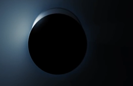
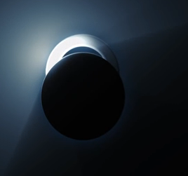
We have decided to entitle our production company 'Encrypted Entertainment' and use the influence of 'Entertainment One's' logo and moving ident. I particularly like the way they have the 'E' emerging from behind a black circle background and would like to create something similar for our ident:


 An Ident idea which I made in order to make the introduction to our trailer slightly more professional is that Gamechanger Films. With inspirations coming from companies such as 20th Century Fox and Lionsgate, shown right, we eventually chose a mixture of the clean font of Columbia and the clean black background of Universal as the main inspirations. This led us to choosing a font, a design and whether there was going to be anything in the background. The layer order, final design, font set up and effects used can be seen in the Photoshop screen grab below.

"
This however never came to be, as the relatively simple looking ident actually took a lot of precision and skill to engineer. Instead of this, we decided that we should design an ident which plays on the idea of the word "Encrypted" rather than the letter "E" as previously seen in the research. This was done through word association, where friends and family were asked what they associated with the word "Encrypted" - results of this can be seen below, with screenshots taken from a skype chat.
Taking forward this idea of security, programming and coding, it seemed logical to have an ident/multiple idents which reflected these ideas. However the making of this ident proved to be too time consuming and difficult as the ideas we had were far too ambitious. A demo of what was attempted can be found below, done by my partner Max, and is not going to be used.
An Ident idea which I made in order to make the introduction to our trailer slightly more professional is that Gamechanger Films. With inspirations coming from companies such as 20th Century Fox and Lionsgate, shown right, we eventually chose a mixture of the clean font of Columbia and the clean black background of Universal as the main inspirations. This led us to choosing a font, a design and whether there was going to be anything in the background. The layer order, final design, font set up and effects used can be seen in the Photoshop screen grab below.
Then came the animation, using Sony Vegas, to mix up the software from the previous ident using Motion, we took this idea of encoding from Encrypted entertainment and carried it over. Utilization of the TV simulator effect, as well as ready made effects used in motion and light flares allowed us to create an ident which both looks clean, professional, and resembles one usually seen professionally. It can be seen below. Sound may still be added, however a silent ident at the start of a tense film, if done correctly, has a majorly positive impact on the first act.
JL MT
Friday, 21 November 2014
Thursday, 20 November 2014
Credits - Research and Influences
Zodiac:
Order of credits as they appear on screen and why:
Order of credits as they appear on screen and why:
- 0.15secs - 'Paramount Pictures' appears on the screen - production and distribution company/s appears first before anything else and this is usually the case for all crime/thriller trailers.
- 0.30secs - 'From the Director of se7en and panic room' - promoting the director of the film and his previous work opens up a wider audience due to the fact that people who enjoyed the films mentioned are likely to go and see this one. This is more of a choice, often depends on the popularity/fame of the director.
- 1.43secs - 'Based on real events' - again attracts a wider audience and creates tension, which is the overall aim of the trailer.
- 2.10secs - the three main actors are now revealed to again attract a certain audience and inform people watching who they are going to see. This is clear from the trailer itself but it is a necessity to show the actors names and often the bigger stars will have their names revealed before the other members of the cast.
- credits appear at the end of the trailer (2.25secs) as they are stating who has been involved in the film/trailer we have just seen.
- Simple white font (something easily found on either word/final cut and/or motion) on a plain black background.
- order of final credits is similar to the order previously mentioned.
Departed:
- 0.18secs - Production/Distribution company/s introduced again (usually most famous and most involved) - follows a similar pattern to Zodiac trailer.
- 0.34secs - 'A Martin Scorsese Picture' - similar pattern with director but this time they have chosen to reveal the directors name.
- 1.07secs - 'Loyalty is a lie' - the main tagline of the film is introduced, which gives the audience an idea about the major theme of the film, which in this case is 'trust'. I particularly like the way they have used two different colours (blue & white) in the graphics to again further support this tagline, that everyone in the film is 'two-faced' and the truth is not being told. This links into our film and the major theme of 'Two-Evils'.
- 1.16secs - 'Sacrifice is a test' - another tagline - creates excitement and again reveals the major themes of the film.
- 1.32secs - 'How far can you take it?' - third tagline.
- 2.07secs - all the most famous actors in the film are introduced similar to that in Zodiac.
- 2.18secs - title of the film is introduced - good use of connotation with the title appearing in the shape of a gun as it not only suggests the genre of the film but leaves a lasting image in the audiences head, which will then carry into the film itself.
- 2.22,23,24secs - end credits introduced (same as in Zodiac).
- 0.19secs - production/distribution company again introduced first (momentum pictures)
- 0.37secs - 'In 2013' - the graphics in this trailer are undoubtedly our major influence with the city landscapes appearing behind the the words themselves. This phrase also creates excitement amongst the audience watching as it adds a sense of pace to the action in this trailer.
- 0.41secs - 'Know' - same effect as previously mentioned.
- 0.45secs - 'Your' - interesting use of graphics that wasn't used on the two trailers prior to this one. Keeps you guessing as to what phrase will appear next.
- 0.51secs - 'Enemy' - similar to departed these tag-lines/phrases set up the theme's of the movie as well as create excitement amongst the viewers.
- 1.08secs - executive producer/director introduced much later than usual.
- 1.42secs - 'Welcome' - clear that the title is going to be introduced in the same style as the taglines previously.
- 1.43secs - 'To' - "
- 1.44secs - 'Punch - "
- 1.45secs - whole title introduced - different to previous trailers as their is a short moment of action after the title is revealed and before the end credits are introduced at 1.48secs.
MT
Tuesday, 18 November 2014
Narrative Graphics Attempts
Narrative graphics are the black screen's usually accompanied by text which are shown throughout a trailer in order to enhance the storyline and allow the narrative to become clearer. Such examples of this come from Redemption, previously named Hummingbird, stating "Time to heal" and "A second chance" on two separate occasions. In conjunction with the shots shown, this tells us where the narrative is going and the tone of the film. By using relatively passive narrative graphics, instead of something along the lines of "Know your enemy" from Welcome to the Punch, one can infer that the tone will take a more emotionally based setting and there will be a lot more focus on the character and his relationships. Some examples of possible narrative graphics are shown below, which were made in one double period by yours truly.

The use of smoke in both narrative graphics board was inspired, once again, by Welcome to The Punch. The white and grey blocks in the background show that the middle is transparent, leaving us to find a moving motion picture or video, either shot by us or taken from a non copyright website. The different colours, red and light blue, are the most prominent colours in our film and bear connotations of danger, desire and high budget films. Although not finalised, the textual content of the graphics comes from the idea of both the police and the underground gangs chasing our main character.


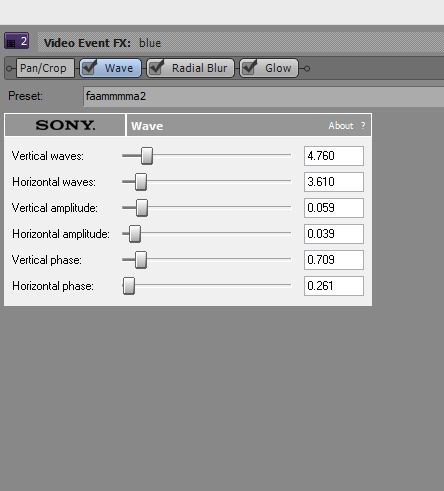
The two above narrative graphics are shown below without added effects from motion and how they were composed using Sony Vegas 12. This was done through using the effects Motion Blur, Wave and Colour Correction underneath a black rectangle with the text cut out which was done in Photoshop (The second graphic down comes first)
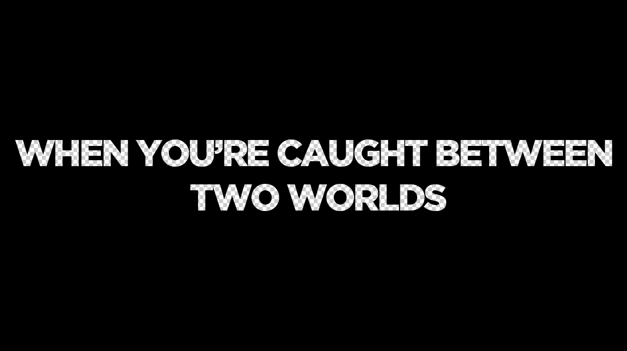
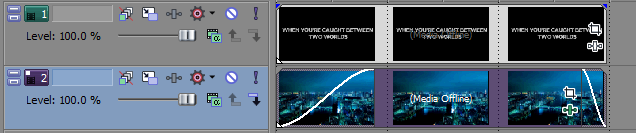
Our final narrative graphic comes from inspiration found in Hummingbird. Although not exactly a narrative graphic as it does not extent the story, as such, introducing previous films which the directors have made is an essential part in raising awareness of the trailer. Because of this we created a background on Photoshop, made up of various layers of non-copyrighted images and including a picture of a sunset I took while in Greece. This was then overlayed with "From the Director's of" and either "Existence" or "The Shadow Man" depending on which shot it was going to be for. These were then assembled on Sony Vegas, again utilizing the Wave and Glow Video Effects to produce this graphic.
JL
The use of smoke in both narrative graphics board was inspired, once again, by Welcome to The Punch. The white and grey blocks in the background show that the middle is transparent, leaving us to find a moving motion picture or video, either shot by us or taken from a non copyright website. The different colours, red and light blue, are the most prominent colours in our film and bear connotations of danger, desire and high budget films. Although not finalised, the textual content of the graphics comes from the idea of both the police and the underground gangs chasing our main character.
We found that the idea of having passive, still smoke on the narrative graphics looked too amateur however and as such changed it to show more technical ability. Using Motion, we created overlays, one of which utilised the using the effects "Embryo" with other effects such as blurs, and then animated to have it moving across the screen. Incidentally this overlay was also used in our ident due to how well it turned out. An example with the overlay on a black background can be shown below, as well as the motion settings which were used.
The Example:
The two above narrative graphics are shown below without added effects from motion and how they were composed using Sony Vegas 12. This was done through using the effects Motion Blur, Wave and Colour Correction underneath a black rectangle with the text cut out which was done in Photoshop (The second graphic down comes first)
Our final narrative graphic comes from inspiration found in Hummingbird. Although not exactly a narrative graphic as it does not extent the story, as such, introducing previous films which the directors have made is an essential part in raising awareness of the trailer. Because of this we created a background on Photoshop, made up of various layers of non-copyrighted images and including a picture of a sunset I took while in Greece. This was then overlayed with "From the Director's of" and either "Existence" or "The Shadow Man" depending on which shot it was going to be for. These were then assembled on Sony Vegas, again utilizing the Wave and Glow Video Effects to produce this graphic.
JL
Sound Influences - Redemption/Hummingbird
0.02secs - already a sound boom to open the trailer, followed by contrapuntal/asynchronous sounds of police car sirens against the opening image of the city and Soho 'backstreets' - the sound boom is used throughout most, if not all crime/thriller trailers and so we will want to use it as well. The use of asynchronous sound is also extremely effective here and we will want to create a similar effect.

0.10secs - sounds of an alarm going off - adhere to the crime/thriller genre and keep the audience on the edge of their seat, which is a desired effect especially at the early moments of a trailer like this. We would like to play around with non-diegetic sound, such as alarm sounds and other 'tension-building' Foley sounds to create different effects at different moments throughout our trailer.

0.15secs - a form of soundtrack begins (the sound of the ticking clock over the top of running music that adheres to the thriller/crime genre). The ticking clock is extremely effective as it not only follows the storyline of Statham's character running out of time as he is trying to escape from the 'bad guys' but also creates suspense, which is the desired effect at this moment in the trailer. We would again like to create something similar and hopefully our music producer, after watching our finished trailer will be able to fit an interesting, yet suspenseful piece of music over the top.

0.21secs - They employ an almost sci-fi style sound boom throughout the trailer at certain moments of tension/suspense. These are extremely effective despite being asynchronous to the images displayed on the screen. This is again, a good use of -non-diegetic sound to create suspense amongst the audience, which is something we would like to recreate.

0.32secs - voice of a man on the phone being played over the top of Statham's characters making himself 'at home' in someone else's house. This is useful as it suggests a lot about the storyline and keeps the audience up to date with what is happening thus far in the trailer.

0.40secs - first bit of 'real' dialogue between Statham's character and the 'love interest' in the film. I particularly like the way they waited 40 seconds before any conversations emerge amongst certain characters in the film/trailer.

0.44secs - Sci-Fi style soundtrack begins at this point after Statham's character says, 'I need to get my life back together' - this suggests that there will be a series of shots representing his character improving the quality of his life. However, the crime/thriller nature of the soundtrack, with the eerie sound booms and the fast flowing pace of the music suggests that Statham is going to take advantage of 'crime' in order to 'get his life back together'. This is an excellent example of how the soundtrack can parallel the storyline, running throughout the trailer and has been an influence to us when thinking about the sound in our film.

1.05secs - sound booms (brooding orchestral noise) used throughout especially during the fight/chase scenes but used as well during the moments, where crime is being shown on camera as seen in the image below where a 'trade-off' of some sort is taking place. We would like to use these traditional thriller foley sounds and add them to our trailer in order to not only adhere to the genre of our film but also to create suspense throughout.

Throughout - soundtrack is used especially during the montage towards the end of the trailer and is 'mixed' together with foley sounds to create tension. Dramatic singing is used to highlight the storyline. Brooding orchestral music is something we will want our producer to make over the top of our trailer, especially during the montage scene and is something we will have to use in order to properly adhere to the thriller/crime genre. However, we will definitely want to our producer to add his own twist on the soundtrack and so will give him some artistic license to experiment with the trailer.

MT
Monday, 17 November 2014
Sound Influences - Welcome to the Punch
Welcome To the Punch:
0.03secs - (Foley) constant ticking sound, which is used to great effect in this trailer as it creates tension amongst the audience, which is essential for a crime/thriller trailer and so the 'WTTP' trailer is adhering to the desired genre. It works in conjunction with the action on screen as it is suggesting that some sort of 'deal' is going to take place and that time is an issue. The ticking noise keeps the audience guessing as to what is going to happen next and is something we would like to use in our trailer in order to enhance the overall quality.


0.01secs - sound boom to start the opening shot of the city skyline (London). Typical way to start many crime/thriller trailers as it instantly places you into the action of the film. Juxtaposed well with the blue/neon lights on screen as it creates this sense of danger/crime but also gives the film a glossy look. We know instantly that the budget of the film is fairly high due to the slick, well controlled lighting and sound boom followed by the non-diegetic sirens over the top of the city landscape (similar to Hummingbird).

0.03secs - (Foley) constant ticking sound, which is used to great effect in this trailer as it creates tension amongst the audience, which is essential for a crime/thriller trailer and so the 'WTTP' trailer is adhering to the desired genre. It works in conjunction with the action on screen as it is suggesting that some sort of 'deal' is going to take place and that time is an issue. The ticking noise keeps the audience guessing as to what is going to happen next and is something we would like to use in our trailer in order to enhance the overall quality.
0.05secs - The ticking noise is also used alongside a sci-fi style soundtrack that increases in volume whenever we begin to see more action on screen. The sci-fi noise works particularly well with the close up of the 'bad guy' wearing a compromising mask and carrying a bag, which is clearly something illegal. It also keeps the tension and sense of danger in the scene extremely well as we are unsure of who the 'bad' characters are and what they are about to do.
Sci-Fi soundtrack - high cord increasing in volume.
0.07secs - Voice over used at the start of the trailer over the top of action. We would like to play with the idea of using both visual and non-visual verbal sound in our trailer in order to create differing effects. I particularly like the use of voice over in this part of the trailer as it works well in conjunction with the shots on screen of the 'bad guy' walking towards the camera and the quick shots of Mcavoy fighting.
0.24secs - Fog horn noise used to open Act 2 after 'momentum pictures'. Adheres to the crime/thriller genre and has an epic, almost blockbuster feel to it, which is something we are interested in. We would like to use a mixture of different foley sounds, such as the fog horn to create the desired tension we would like to create in our trailer. (fog horn noise is almost brooding over the other sound involved)
0.40secs/throughout - Soundtrack - gives the trailer a certain flow and makes the trailer feel instantly more epic when watching it. The soundtrack gives the trailer a certain rhythm throughout that links every shot/scene change together. Also allows for the flow of the trailer to run smoothly whilst creating a tense and even powerful atmosphere.
MT
Sunday, 16 November 2014
Sound Practice
Just to check that we had a firm hold upon the logistics of using the sound equipment and in what situations to use each one piece of tech, following on from my previous post as to sound on location, a short piece was shot using an improvised script but as good sound as possible. The below is the result, utilising the boom pole, directional microphone, two sets of headphones, the camera and the surround sound mic as well as "Dead kittens" on the end of each of the mics to cut out wind noise and external feedback. On the actual micro track the gain was used to control the sound which was naturally recorded, keeping it around -10 so it could be edited to the best of our ability in Final Cut. By aligning the peaks in the sound bar from both the camera and micro track we were able for replace the camera sound and increase the quality of the audio tenfold. The difference can be seen compared to the test where only the camera sound is used above.
Saturday, 15 November 2014
Narrative Graphics Influences

 Welcome to The Punch - The narrative graphics used within Welcome to The Punch were a major influence of ours, as was the film itself. The blue on black which is shown so much within the trailer is reflected within the narrative graphics, showing phrases which enhance the narrative along with the colours used, bearing connotations of big city life and mainstream films. The graphics use a blacked out png file with transparent text in the middle which is then placed in to a video editing software, overlaying the png on top of a moving/animated still of a city which has effects added to it. There are then multiple light and smoke layers placed on top of the black screen, which connote mystery and add to the aesthetic effect of the graphics. There is a slight reflection of the text in certain areas of the blacked out background which shadow the moving image which animates the graphics, and the words get closer to the foreground of the screen as they go on. This highlights their importance as well as emphasising the technical skill needed to make it, bring the audience closer to the animated background and smoke overlays.
 Only God Forgives - These narrative graphics are similar to Welcome to The Punch in their use of colour to bear connotations of the film, as well as their use to enhance the storyline. Apart from this, however, there is not much similarity at all. The use of dark red/neon colours throughout the film is reflected within these narrative graphics, connoting danger, lust, death and love. These are shown within the shots in the film, however the Oriental feel really comes out within the first two narrative graphics especially, showing these neon style text segments overlaying a traditional Samurai pattern on a paper wall. The final narrative graphics, which introduce the actors, don't replicate this use of traditional oriental design in the background and as such suggest something concerning the film, a sort of out of place-ness. The director is also introduced within the graphics, labelling himself as "Visionary"and referencing previous films he has done, of which Drive is his most famous. The fell of the graphics are very similar to the tone of drive, which can be seen later in the post, and as such builds up a fan base of stylised high budget crime thrillers. As previously, the text and background image come towards the audience, bringing them in to the film and increasing appreciation of the style of the film.
 Hummingbird - The graphics within Hummingbird are very different to the previous two examples/influence. They prefer a clean and easily readable style which again connote things which are going to happen but are done much more plainly, perhaps referencing the lower class/dangerous background in comparison to the previous two examples. The text is a sans-serif font with an outer glow and written entirely in capitols on a black background, again utilising smoke and light overlays to stop the graphic looking completely plain. The fragmentation of the words, as can be seen in the first example, bears reference to the main characters past and in hindsight is a quirky and interesting touch on behalf of the director, which only the active audience members ail pick out. This is reflected within the fact that the text is not centred on the screen and enforced through the shots shown prior to and post-graphic, leading the audience to experience a complete feel for the film as something more than just a mindless Jason Statham action movie. As the pace of the film picks up, the overlays on the background become more and more vivid and the text becomes bolder and with a greater glow radius, showing how what is says is becoming more and more important.
 Drive - These graphics are the most different from the previous three examples. Instead of being overlaid on top of a black background which has some form of effect on it they are overlaid on a panning ariel shot of the city. This would imply, along with the simplistic font and slight effects on the text, that what they are saying is more important than the connotations of knowledge of the city and sense of direction which come through. The reference to the actors Ryan Gosling and Carey Mulligan are therefore implied to be the films best selling points, along with the strong narrative which is established and the stylised and slightly Only God Forgives-esque neon/city feel. Because of this simplicity there is less to talk about due to the majority of the narrative telling being done within actual shots, and as such are not so much influences, but an option which we may be able to consider. We will probably not use this design however, as due to our lesser film making abilities, require the narrative graphics in order to enhance the narrative to a similar extent than our shots do.
Friday, 14 November 2014
Title - Initial Photoshop and Motion Designs
As part of my research into titles and title graphics, I decided to come up with a design in order to ascertain the difficulty involved in different aspects of design, and to get a better feel for the look of our trailer. The title used is only a working title, as 'Two Evils' gives the title a slightly more horror-style feel, which is not something we are looking for.

This first attempt I think can be said to be one of varying success, but it may well influence our final design.
There was another attempt before this, however this was attempted using Illustrator rather that Photoshop, and using the Rockwell Extra Bold font suggested by Joe in his graphics research. My knowledge of Illustrator is limited, and I was attempting to get some sort of smoke or cracking effect on the backdrop. The colour scheme is along the correct lines but other than this, very few aspects of this titlecard are successful. This altogether less successful initial design can be seen here, in the wrong aspect ratio, in the name of showing the full process of my designing endeavours.

Following my attempts at still designs for the title card on Photoshop, I moved to Motion to see if I could use my ideas from influences, planning, and previous attempts, to create a moving title card that would look more effective following a sound boom and dramatic montage. I came up with three designs here, and I will ask the group which they think is the most effective.
This first design is monochrome, which I do not think plays into our genre or tone. The smoke effect of white on black does have a certain boldness but I personally would not choose this design as the final title card.
This design is coloured, and fits better with the colours and tone we intend our trailer to have, but I don't think the smoke effect is as effective as the first design, potentially due to the white text on the brightly coloured backdrop.
I believe that this third design is my strongest. It takes the best points from the still Photoshop design and adapts them to a moving Motion image. The colouring is bold and the smoke effect gives the feel I think I have been meaning to achieve throughout the design process.
CM
This first attempt I think can be said to be one of varying success, but it may well influence our final design.
There was another attempt before this, however this was attempted using Illustrator rather that Photoshop, and using the Rockwell Extra Bold font suggested by Joe in his graphics research. My knowledge of Illustrator is limited, and I was attempting to get some sort of smoke or cracking effect on the backdrop. The colour scheme is along the correct lines but other than this, very few aspects of this titlecard are successful. This altogether less successful initial design can be seen here, in the wrong aspect ratio, in the name of showing the full process of my designing endeavours.
Following my attempts at still designs for the title card on Photoshop, I moved to Motion to see if I could use my ideas from influences, planning, and previous attempts, to create a moving title card that would look more effective following a sound boom and dramatic montage. I came up with three designs here, and I will ask the group which they think is the most effective.
This first design is monochrome, which I do not think plays into our genre or tone. The smoke effect of white on black does have a certain boldness but I personally would not choose this design as the final title card.
This design is coloured, and fits better with the colours and tone we intend our trailer to have, but I don't think the smoke effect is as effective as the first design, potentially due to the white text on the brightly coloured backdrop.
I believe that this third design is my strongest. It takes the best points from the still Photoshop design and adapts them to a moving Motion image. The colouring is bold and the smoke effect gives the feel I think I have been meaning to achieve throughout the design process.
CM
Subscribe to:
Posts (Atom)