Tuesday, 31 December 2013
Back From Vacation
Back to school from Christmas holidays and ready to start working on the media project again. Filming planned for this weekend as last weekend there were some problems with actors that weren't especially major. We plan to shoot a majority of our film opening this weekend, except some of the shots must be done at a later date as one of the three actors isn't available. Looking forward to it
Tuesday, 10 December 2013
Research And Planning Conclusion
Using all the data I have compiled from questionnaires, vox pops, and various internet research I feel that me and my partner have successfully developed a plan for our film opening which will cater to our target audience while still enticing people in smaller, niche markets which will increase sales and hype around our eventual film. The filming will be done at various points from the Christmas holidays to the first couple of weeks back, leaving us plenty of time to edit on Final Cut Pro.
The skills we have learnt from things such as our preliminary task, the filming of "The Package" And that of our short clip about a nightmare parents evening will all help in the production of our final product 'Existence', highlighting things we must remember about sound, lighting and different camera angles. Within Final Cut, a wide range of effects such as blurs, sound effects, noise gates and various other things will enhance the way our film seems and set us apart from the rest.
In terms of actual filming, we will be using clapper boards, directional microphones, microtracks, an HD camera, a tripod, and battery lights. This wide range of equipment can help us obtain the quality we are ultimately looking for. When filming, we will take extra shots as fillers so we aren't constrained to one sequence of shots, especially seeing as they may not work as well together as we would wish.
Finally, when on location all aspects of planning will be used in order to decide lighting, the tone and the mood of the film being sure to cater to our target audience.
JL
Actor - Kevin
The actor we have got for Kevin is Barney, another friend of our and this time an actual actor. With Kevin, the need for someone who can actually act is necessary in order to show his fragmented mind and brings in the idea of the psychological. If the role wasn't played well, not only would it make the film look bad but defeat the purpose of having the whole film about tone. Doing drama A level, Max can adapt to any situation given to him with a lower class, insane Hitman being a walk in the park. The style of clothing and look we wanted to give Kevin can be reflected in Max due to what we dress him in, the way we take shots of his face and the way in which he talks. He must look confident, at points (Such as when meeting his boss) yet switch to moments of distress (during the flashback) in moments and because of this we chose Barney. A photo can be seen below of the character, not wearing what we want him to but still showing what he could look like.
JL
Actor - Tyrone
For the role of our pursuer, and main antagonist, we have chosen our friend David. He is tall, well built and can have the effect of portraying a menacing figure which is perfect for our film. In the alley-way scene, and after he will be wearing all black with his face partly covered up showing his mysterious and threatening nature. Although not an actor, with no lines and a mainly visuale role to play his looks matter most, being he reason we chose him. Again, like the actor we chose for Kevin's Boss, he is readily available over the Christmas holidays and when we come back, meaning early filming can take place. Photos shown below show his stature and how he could end up working in the actual film opening.
JL
Actor - Kevin's Boss
Kevin's Boss
Kevin's boss will never actually be seen in full light. The scene at the top of the tower, which occurs towards the end of the opening. His face will be in shadow and fitted out in high quality, smart clothing. Because of this, the age of the actor doesn't need to fit with that of the character as long as he sounds old and can pull off the look, it will work. Because of this, we have chosen our friend Michael Hajiontonis for the role due to his range of voice. The photo below shows him in clothing not dissimilar to what he will be wearing in the film (see Kevin's Character post). He lives relatively close to us and is free all winter, meaning we can get filming done before the return back from school.
JL
Kevin's boss will never actually be seen in full light. The scene at the top of the tower, which occurs towards the end of the opening. His face will be in shadow and fitted out in high quality, smart clothing. Because of this, the age of the actor doesn't need to fit with that of the character as long as he sounds old and can pull off the look, it will work. Because of this, we have chosen our friend Michael Hajiontonis for the role due to his range of voice. The photo below shows him in clothing not dissimilar to what he will be wearing in the film (see Kevin's Character post). He lives relatively close to us and is free all winter, meaning we can get filming done before the return back from school.
Monday, 9 December 2013
Script
The only times in which speech is used within the opening to our film is at the very start, where he answers the phone and then on top of the tower where Kevin's boss hands over the money for taking out the hit. In the first instance, we saw keeping it short and sweet the best;
Kevin: [Answers Phone] Hello? Who is it?
Boss: [muffled voice, at the other end of the phone line] Meet me at the top of the tower at 8.
[Phone line goes flat]
We saw this as important, the boss' lack of an introduction highlights his importance and how well known he is to Kevin. In terms of the second occurence of speech, A juxtaposition between the distress Kevin was feeling in the hotel room scene and his confident attitude when talking to his Boss should be shown in order to portray his fragmented psychosis.
[Kevin is Looking out the window over the view of London. His Boss enters up the stairs behind him and Kevin turns around and acknowledges him with a nod. Neither character are fully visible]
Kevin: Boss, its done, There is no way he could have survived that.
Boss: Good. Ill be in touch. Until then, don't fuck up. [Hands package over to Kevin]
JL and JR
Filming Schedule
Location:
Alleyway/Road (Location 1 Post)
Date: 19th December - 8th Jan 2014
Actors Required: Tyrone and Kevin (Actors TBD) + P.O.V shots
Notes: The P.O.V Shots, not requiring any actors apart from Tyrone are going to be done over Christmas as they can be done quickly and well, with multiple different takes in case we need an alternative shot (First idea doesn't work etc.)
Tower + Elevator (Location 2 Post)
Date: 8th Jan -
Actors Required: Tyrone, Kevin and Kevin's boss (Michael + Actors TBD)
Notes: The night which we choose must be clear and the shot will be taken at twilight. Being January, we only have a short time to take the shot so multiple days may be needed in order to get the take done well. Also, It is while we are back at school so all of the actors are easily accessed after school etc.
Kevin in the Hotel (Location 3 Post)
Date: No set date has been allocated, with only 1 actor needed and the majority of the atmosphere in the scene coming from Effects such as the phone ringing at the right time and voice over the phone, it can be done quickly meaning more time can be spent focusing on editing.
JL
Sunday, 8 December 2013
Style and Tone Research - Shutter Island
 Style and Tone Research
Shutter island, having been already analysed in a previous post is a film about Teddy Daniels (Leonardo DiCaprio) and his psychological battle to try and obtain sanity - having been sent to an state jail located on an isolated island. Some shots in the film allow us to gage Teddy's personality and to what extent he has a fragmented personality. The shot seen to the right, an establishing, fixed shot is essential in seeing his deteriation in mental health from the start of the film to the end, where he is seen holding a match in front of his face, wearing prisoner clothes. In the shot seen above, the focus of the camera is on Teddy, with everything around him blurred. The presence of a police officer is the background allows us to set the scene, with the obviously artificial lighting helping build the atmosphere. Compared to our film, this shot is very similar to the first shot in ours, with the zoom in to Kevins face. We figured we could take the idea of a blurred background and transpose it to our film, helping to build the same atmosphere as Shutter Island at this point.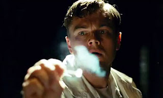 As mentioned above, this shot helps us to see the mental and physical deteriation of the main character. The use of the mid - close shot with the blurred background again allows us to focus on Teddy and analyse his looks, without being distracted by the background. The dark lighting with the only thing illuminating his face being a match allows us to paint the picture of the fragmented personality. The image shown below right is referring to a dream Teddy has, where he sees his dead wife only for her to dissapear leaving nothing but blood in the room. Rather obviously, these are not normal dreams to have. The shot itsself takes place in a dessolated place, seemingly the couples old house. The fading away of his wifes body represents the fading of his sanity and the effect of his pass on him.
 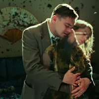 Overall, in Shutter Island the use of lighting is the main way in which style and tone is portrayed. The usually dark or isolated imagery are essential in showing us the workings of Teddy's mind, especially his fragmented personality and mental deteriation through the film.
 JL
Friday, 6 December 2013
Representation
Gender
Masculinity vs Femininity - In the actual opening of our film, we do not have the presence of a female character. Later in the film however there will definitely be the introduction of a partner for the main character, Kevin, however this is not seen in the opening. The idea of gender equality however can't be seen because of this, however the idea of where a male should be in society can be. The three male characters in the opening are all in different parts of the community. The boss, in a position of power, Kevin in a vulnerable position and the pursuer in the working class. This shows that it is not always males in high up positions, unlike many other films of a similar genre. The world we are representing is that of a dimly lit area in London surrounding by housing estates and tacky shops, leading to the atmosphere which is created within the film. Due to this however, the place is not isolated due to an abundance of buses, taxi's and trains however it does give the idea of isolation within the class system, being trapped and the only way out is to make money. This leads on to the social circumstances, which are not as well represented as character. All of the characters have shady job,s one killing someone for money and the other ordering out the hits - This would be another reason why the film would be rated 15 (as seen in citification post) Due to influential younger members of the audience taking ideas from watching the film.
Axes Of Identity
Within the opening to our film, the age of the character usually represents how much power they have due to Kevin's boss being older than him, and Tyrone being younger. The lack of a female character within the opening however doesn't allow relationships to be formed within the opening, apart from implications that could be made with photos in the background or various things around the house. Cultural background and disability are again void within the opening, however implications that Kevin is a working class citizen is shown due to his surroundings in London and accent. A multitude of the details about the opening, much like Fight Club and Identity, are implicit and would make more sense after watching the whole film. The only explicit things are the roles of the different characters.
Ideology
The ideology behind the film is that there is a man who is struggling for money as he is staying in a B&B and he has little money. This is associated with The character of Kevin having to kill a man for money. The opening of this film would suggest that this is the first time that Kevin has performed an act of Murder for money as he is going out of his mind having killed. The way that I would like the character of Kevin to come across to the audience would be to show that Kevin is an ordinary everyday man living in London caught in a struggle for money. Kevin turns to his boss to kill a man for money and his boss meets up with Kevin in the opening of the film to hand him the money. Kevin is going insane because of the killing and he seems to think that the victim who he killed is following him and is haunting Kevin.
JL
Axes Of Identity
Ideology
The ideology behind the film is that there is a man who is struggling for money as he is staying in a B&B and he has little money. This is associated with The character of Kevin having to kill a man for money. The opening of this film would suggest that this is the first time that Kevin has performed an act of Murder for money as he is going out of his mind having killed. The way that I would like the character of Kevin to come across to the audience would be to show that Kevin is an ordinary everyday man living in London caught in a struggle for money. Kevin turns to his boss to kill a man for money and his boss meets up with Kevin in the opening of the film to hand him the money. Kevin is going insane because of the killing and he seems to think that the victim who he killed is following him and is haunting Kevin.
JL
Final Ident Plans
JJ Star Productions
The idea for the actual logo came from my partner, with both our first name beginnning with J. The initial design (see below) was done on paper, with the studio of the logo already in mind. The original idea was that the two J's come from either side of the screen and meet in the middle, causing sparks. The star would then fade in from black on the space background shown below. The space background we are going to use (And eventually edit in motion, for animation) is a copyright free image taken from google images - and its use acknowledged. The reflection of the word "Productions" in our logo along with the different colour ways were the idea of my partner, with both white and both black not having the same appeal as the mixture of the two. We thought the black made the white stand out, and vice versa. The use of black and white was chosen in order to look retro, and also complimented the background - making it stand out while keeping the main logo looking professional.
The idea for the actual logo came from my partner, with both our first name beginnning with J. The initial design (see below) was done on paper, with the studio of the logo already in mind. The original idea was that the two J's come from either side of the screen and meet in the middle, causing sparks. The star would then fade in from black on the space background shown below. The space background we are going to use (And eventually edit in motion, for animation) is a copyright free image taken from google images - and its use acknowledged. The reflection of the word "Productions" in our logo along with the different colour ways were the idea of my partner, with both white and both black not having the same appeal as the mixture of the two. We thought the black made the white stand out, and vice versa. The use of black and white was chosen in order to look retro, and also complimented the background - making it stand out while keeping the main logo looking professional.
JL
Ident Studio and Design Plans
In terms of the Ident relating to the type of film we are making, the suspenseful and mysterious nature of the background compared to the retro and clean look of the logo show that we have an original idea but wish to take a new spin on things and give it a side which people haven't seen before. Inspirations are taken from Lionsgate suspenseful and clean logo with a natural background and Paramount, concerning the same things.
Previous versions of the Ident and ideas for it are shown below - With different backdrops, text styles and ideas for the studio. The name was fixed from the start however. The metal texture which we eventually used on the white part of the logo is also shown.
JL
Ident Research
Lionsgate
This is the ident for the famous Lionsgate production company. This is the famous ident which was famous to start before the Saw film series. The way that this ident is put together is very clever as the clogs turning through the key hole and all inside a big gate, linking to the name and logo of Lionsgate.
Warner Bros.
This is the ident for Warner Bros. film production company. This ident is very famous linking to the Looney Toons franchise. The ident is made up of a gold shield where the letters of W and B as shown together and a band like gold material displays the name around the shield. The beginning of the ident displays some factories or building of some sort shining in reflection on the gold shield when the motion of the shield moves and displays the whole logo.
20th Century Fox
This is the famous ident of 20th Century fox film production company. 20th Century Fox are famous for recent films such as; The Internship, Life of Pi and the latest X-Men-Wolverine film. 20th Century Fox has also been famous for the production of the highly interested, 'The Simpsons' franchise.
Paramount
This ident shows the Paramount Pictures production company's logo and motion intro. this is shown at the beginning of the film being shown along with all the other idents and logos shown above. Paramount Pictures are well known for the recent films such as; Iron Man 3, World War Z and Star Trek-Into Darkness.
JR
Thursday, 5 December 2013
Titles Test
This is a short clip showing how the titles may visualise in the opening scene of my partner and I's film. The titles on our clip will be shown at the end of the opening scene where the camera shots will be short 2-3 second long close up images being everyday pictures. For example, a table where subsequently a knife is placed down which is connected to a killing, where the victim is stabbed. The camera shots will be created using short and far focus to suggest a more atmospheric opening title sequence. The title and producers, etc. will be displayed as demonstrated in this short clip below.
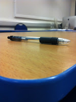
These are the photos showing how the titles will look with the pictures in the background. The first picture shows the focus and look of a shot where just a plain table is in sight. The second photo shows how the Knife will look on the table being placed in shot (shown as pen). The use of short and far focus will make a good looking image.
In the majority of mainstream films, the titles at the start appear in order of the importance of the actor; with the main actor and main character coming first with other leading actors afterwards. This will be reflected in ours with Barney, David and Michael' names appearing first followed by the producers. The title will come at the end of the opening, when the meeting with Kevin's boss finishes. The film will be called 'Existence' - and a preview of what the title will look like can be seen in the Titles Planning post.
JR + JL
Film Title Planning + Some Graphics
Many of the films of a similar genre have names which are short, catchy and suggest something about the mind or psychological. Many are only one word long - Examples being:
From these findings we can take that the title of our film should follow the pattern, as countless films before us can't be wrong as to what works as a title. In terms of the one word approach, a synonym of something like fracture we found would work the best - Such examples include;
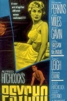
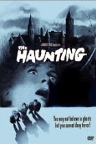
Taking the idea of the title being 'Existence', this then brings up the question as to how it is going to look in the film and on the title poster (usually both the same). Again taking inspiration from previous films of the same genre, the norm is to have either a very plain title which emphasises the name of the film, or a faded and horror styled font such as True Lies (True Lies Font Download) which sets the tone of the film. In the poster of Psycho, one can see the crack going through the centre of the text shows the fragmented nature of the 'Psycho'. Similarly, in 'The Haunting' the title takes a traditionally Gothic font and background.
Finally, in terms of the structure of various films titles and opening scenes, especially within the Psychological thriller genre, the credits appear during the opening scene in order for the action to commence straight away. It also contextualises the names and from the first second you can guess what sort of a film you are going to be watching. Examples of such title sequences are Memento (shown below) and Seven (also Shown Below). We see our opening as a possibility to embed the titles like the bottom two do, with the black flashes showing the actors names with the producers names (us) and production company placed throughout the opening.
JL
- Identity
- Seven
- Fracture
- Flatliners
- Unbreakable
From these findings we can take that the title of our film should follow the pattern, as countless films before us can't be wrong as to what works as a title. In terms of the one word approach, a synonym of something like fracture we found would work the best - Such examples include;
- Rift
- Splinter (Already Taken)
- Breach
- Schism
Taking the idea of the title being 'Existence', this then brings up the question as to how it is going to look in the film and on the title poster (usually both the same). Again taking inspiration from previous films of the same genre, the norm is to have either a very plain title which emphasises the name of the film, or a faded and horror styled font such as True Lies (True Lies Font Download) which sets the tone of the film. In the poster of Psycho, one can see the crack going through the centre of the text shows the fragmented nature of the 'Psycho'. Similarly, in 'The Haunting' the title takes a traditionally Gothic font and background.

Finally, in terms of the structure of various films titles and opening scenes, especially within the Psychological thriller genre, the credits appear during the opening scene in order for the action to commence straight away. It also contextualises the names and from the first second you can guess what sort of a film you are going to be watching. Examples of such title sequences are Memento (shown below) and Seven (also Shown Below). We see our opening as a possibility to embed the titles like the bottom two do, with the black flashes showing the actors names with the producers names (us) and production company placed throughout the opening.

JL
Titles Research
Seven
This is the opening titles for the film of Seven. The opening is very dark, and mysterious whilst being slight strange. The Title consists of small blades and someone shredding the skin of the end of his fingertips, and sewing together sheets of paper. This is a quite weird but interesting opening and certainly asks questions in the audience.
It Might Get Loud

This is The opening titles for the film This Might Get loud. The use of short and close focus is what interest me most about this opening titles sequence. The use of close up shots of the guitars is also what inspires me about this opening.
Red Lights
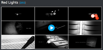
This is the opening title sequence for the film called Red lights. The use of Shadow and light and dark is used very well in this opening sequence. The faded focus also is a good way in which this sequence is put together. The close up shots with faded zooms and focus are what i want to add to my title sequence at the end of the opening scene.
My opening scene would be made up of short shots in which have close up shots of everyday objects which have a twist to them, so say there is a close up of a table with close zoom and then a blooded knife is placed on the table. The titles would fade in on the shots with the Credits. The shots would only be about 2-3 seconds long and to merge the shots they would slowly fade in and out.
JR
This is the opening titles for the film of Seven. The opening is very dark, and mysterious whilst being slight strange. The Title consists of small blades and someone shredding the skin of the end of his fingertips, and sewing together sheets of paper. This is a quite weird but interesting opening and certainly asks questions in the audience.
It Might Get Loud

This is The opening titles for the film This Might Get loud. The use of short and close focus is what interest me most about this opening titles sequence. The use of close up shots of the guitars is also what inspires me about this opening.
Red Lights

This is the opening title sequence for the film called Red lights. The use of Shadow and light and dark is used very well in this opening sequence. The faded focus also is a good way in which this sequence is put together. The close up shots with faded zooms and focus are what i want to add to my title sequence at the end of the opening scene.
My opening scene would be made up of short shots in which have close up shots of everyday objects which have a twist to them, so say there is a close up of a table with close zoom and then a blooded knife is placed on the table. The titles would fade in on the shots with the Credits. The shots would only be about 2-3 seconds long and to merge the shots they would slowly fade in and out.
JR
Monday, 2 December 2013
Certification
Certification
The certification we choose for our film is a 15. This is because we see it as containing strong violence, not so much in the opening but planned to be later in the film - and "Frequent use of strong language" which both come under the bbfc 15 rating. Also, the idea of a lack of moral compass is essential in how we decided what we were going to rate our film. The point of our film is to create suspense and an attachment with the main character, who takes hits out on people to gain money. Because of this, younger more influential people could take violence to be seen as a good thing and as such give off the wrong idea about what is deemed acceptable. Going off of this point, the Official BBFC website states that "Easily accessible weapons must not be glamourised", because of this (With the knife in the opening scene) we can't pay much attention to it and must make it understated. Within the rest of the film, uses of guns or other weapons could be used but none as easily accessible as the knife. The language used must not also be used in a threatening way when coupled with its frequent use, and as such must just be used in times of panic or distress. A complete lack of sexuality within the film also helps.Compared to 18 films however, our film doesn't focus on the violent and urban features of the films but more the psychological and the mood. Because of this, the "Strong blood and gore" and "very strong violence" are not relevant. It also states that "Dwelling on the infliction of pain or injury" which like mentioned before, we do not want our film to be about. Our film definitely rises above the boundaries of 12 and 12A however, which don't allow dwelling on the sight of blood or killing, with a definate lack of gore. We see in our film this lack of blood would defeat the realism we wish to create and actually put audiences off, especially as the focus of the film is to create an atmosphere that's as realistic as possible.
JL
Subscribe to:
Comments (Atom)


